CS180 Project 2: Fun with Filters and Frequencies
Part 1
1.1 Finite Difference Operator
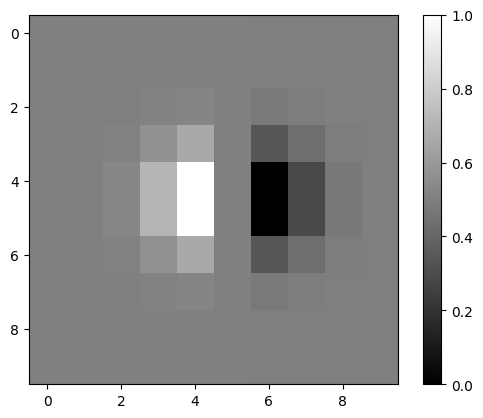
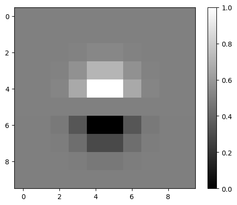
In order to compute the gradient magnitude of the camera man, we need to use these 2 vectors
which are the finite difference operators for the x and y directions. More specifically, we convolve the source image with the finite difference operator.
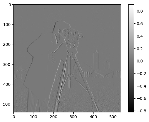
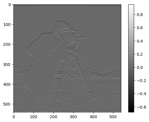
An intuitive way to think of the operators: you are getting the difference between the 2 adjacent pixel values. If the difference is big, that will result in a larger difference, which will be reflected in the gradient magnitude image as darker pixels. Using should show you the vertical edges, while using should show you the horizontal edges.
Partial Derivatives in X & Y directions
Now let’s see the camera man’s partial derivativeses.
Now let’s try creating the gradiant magnitude image for the camera man. Here’s the raw gradient magnitude image:
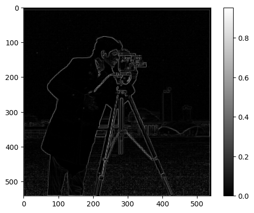
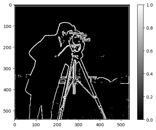
You can see the edges, but not so clearly. Let’s try binarizing the image. I set the threshold to 0.23, meaning any value below the threshold is set to 0 & any value above the threshold is set to 1. Here’s the result:
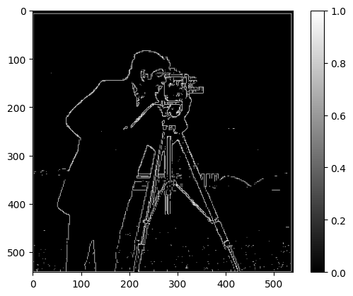
Much more clear! But we see some dots near the bottom of the image. This gradient magnitude image is noisy. We will see how we can improve upon these results in the next section.
1.2 Derivative of Gaussian Filter
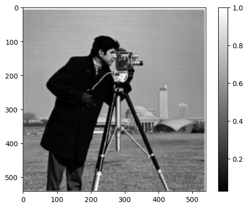
First, I’ll create a blurred version of the cameraman by convolving a 2D gaussian kernel with the image. For the gaussian kernel, I used . On its right is the binarized gradient magnitude image. This time, I set threshold is lower to 0.08.
After smoothing the image, much of the noises are removed, while the edges are still preserved in the image. The reason that the threshold had to be lower might be that the gaussian filter is a low-pass filter, thus the remained pixel values are lower than before.
A nice property of these linear transformation is that we can easily combine transformations beforehand and apply them all to the target image at once.
Let's see what the DoG filters look like. To get the DoG filters, I convolved the kernel with
and
Let’s apply these to the camera man image. After the convolving operations, we get this edge image below. To its right is the previously obtained edge image for reference.
They look identical! This is exactly what we excepted: we can
- separately convolve the finite difference operators first with the original image, then convolve the resulting image with the gaussian kernel, or
- convolve the gaussian with and first, apply the DoG filters to
Part 2
2.1 Unsharp Masking
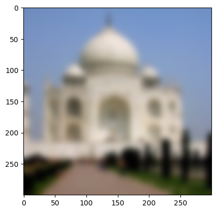
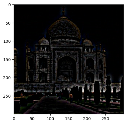
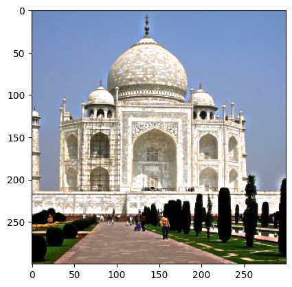
Before combining the sharpening operation into a single transformation, let’s use an example to see how it works. We start by applying a low-pass filter — the gaussian — to get the lower frequency pixels. We then subtract the low-passed pixels from the original image which leaves behind the high frequency pixel. Lastly, we add the results of the subtraction to the original image to emphasize the high frequency pixels, thus making the image sharper. Here’s the image for each step:
The most prominent result is that the dark parts got darker and bright parts got brighter. You can also see a bit of a halo around the peak of the center dome. The edges around the bricks on the center dome also become more pronounced.
Combine into one transformation
Now we will combine the whole operation into a single linear transform. Here’s the formula I used:
I introduced a parameter sharpness_strength to allow more flexibility on how much sharpness you’d like to add. Experimenting with this strength creates better results with different images.

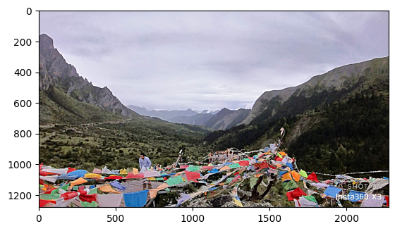
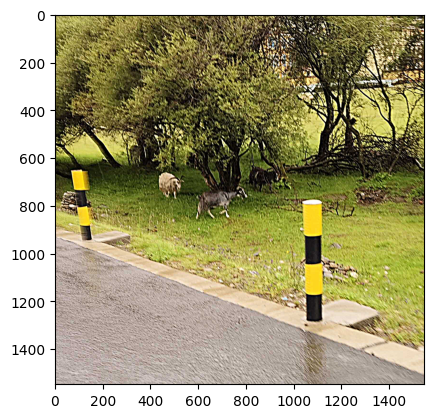
Edges of the main objects in the images are much more clear. However, since we aren’t really adding more details in this image, they don’t look that much better quality-wise.
Blur and resharpen
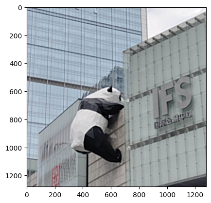
The resharpened image did not come out as good as the original image. Compared to the blurred image, the resharpened had more pronouced edges and shadows at places where the frequency is relatively high (for example, the shadow on the IFS sign). The many edges on the panda were also more clearly restored in the resharpened image. Interestingly, if you look closely at where the panda's right hind leg connects with the body, there is a very bright streak of white. In the original image, it isn't nearly as pronouced. This may be due to the rapid change in color in between the 2 regions.
2.2 Hybrid Image
Generally, hybrid images have not come out as well as I wanted them to be. Aside from good alignment, structural & composition similarity is also crucial for good results. I’m not fully sure the role that color plays in the process, as I tried to create hybrid images with similar & dissimilar colors.
Let’s start with Derek and Nutmeg. Here are the images again:
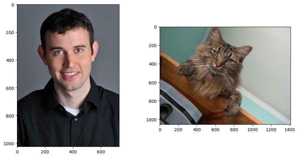
First we needed to align the images. To avoid sharp edges after alignment, I extended the edges after rotation using the nearest pixel to the edge.
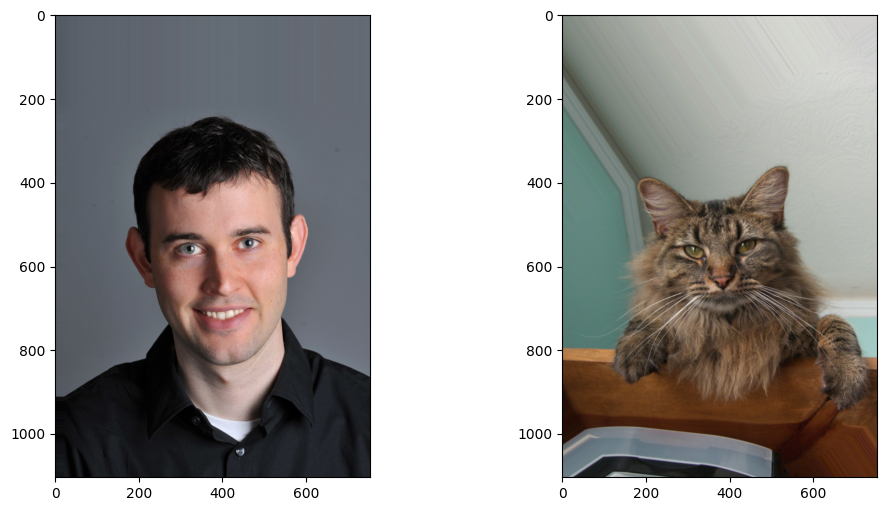
I tried to create the hybrid with both grayscale version and the color version. Here are the results:
I dimmed the color version to avoid Derek’s face being too prominent in the resulting hybrid.
Analysis
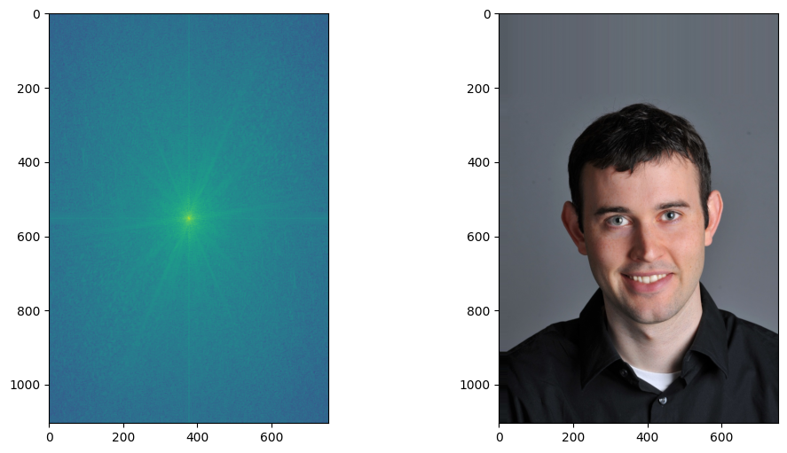
Derek & Fourier of Derek
As shown in the discrete fourier transform of derek's greyscale image, the center is the brightest, which indicates that the portrait of Derek doesn't contain too many high frequency regions but is rather smooth and uniform. There is one more prominent streak, almost horizontal but tilting a bit, which may correspond to the intersection of shadows and highlight on the face.
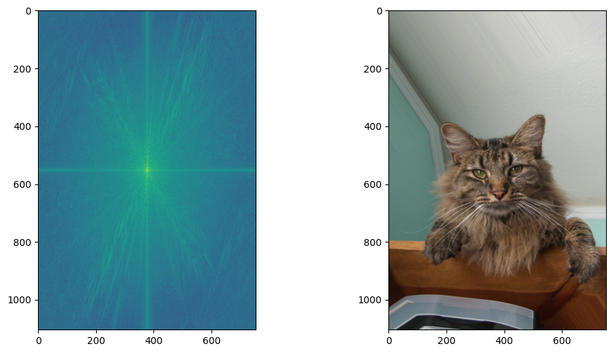
Nutmeg and Fourier of Nutmet
Nutmeg's fourier transform contains a lot more bright streaks away from the center. This can most likely be attributed to the rapid change in colors across Nutmet's fur. the edges of the desk and the intersection of the wall and the cells are also represented with brighter streaks in the transform image.
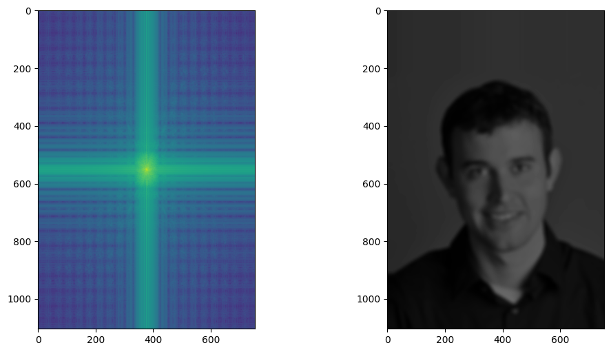
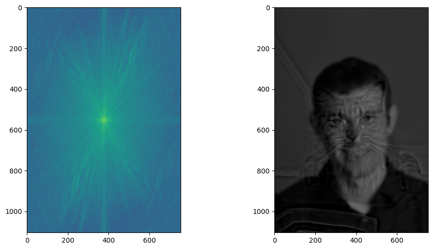
Result Image Fouriers
For Derek, color of the frequency map is most intense in the center, which means most of the frequencies remained for derek are low.
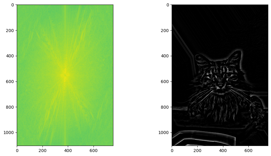
Nutmeg's fourier transform is almost fully lit up across the entire image. All high frequncies across the board for the sharpened nutmeg.
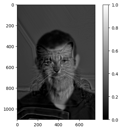
Lastly, the hybird image's fourier transform shows more varied color intensities. There are high frequncies from nutmeg and low frequencies from derek, as we expected.
Additional Results
Good Case: last year I went to a car show/event and took some pictures of the cars at a similar angle. Here are the original images of the purple porsche and the white lamborghini:
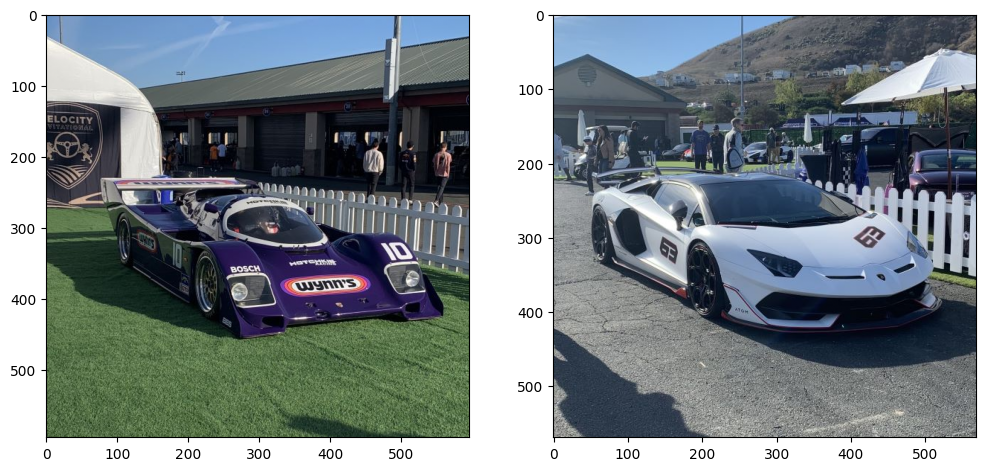
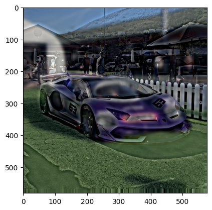
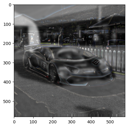
Since the angles and the compositions of the images almost already match up, I had to do minimal alignment. Here are the hybrid images:
The purple color is very prominent in the color version of the hybrid, which made it a bit hard to see the white car up near. In the mixed hybrid image, I combined the greyscale blurred of the purple car with the color version of the white car’s high frequency image. This time, it looks a lot better.
Failure Case
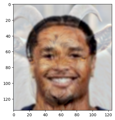
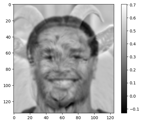
I tried another combination of faces, this time with Cal’s star running back Jaydn Ott and a goat. This time, I couldn’t get a good balance between the near and far images. Either our running back’s face is too prominent, or the edges on the goat take over the viewing.
2.3 Gaussian and Laplacian Stacks
Here’s Oraple’s Gaussian and Laplacian stacks:

For visualization, I normalized the Laplacian filters. Furthermore, I had to light up the level 0 Laplacian filter to make it a bit more visible.
2.4 Multiresolution Blending
Orple
Lastly, let’s construct the orple from the apple and orange. The images have the same dimensions, so I didn’t have to do any crop or image alignments.
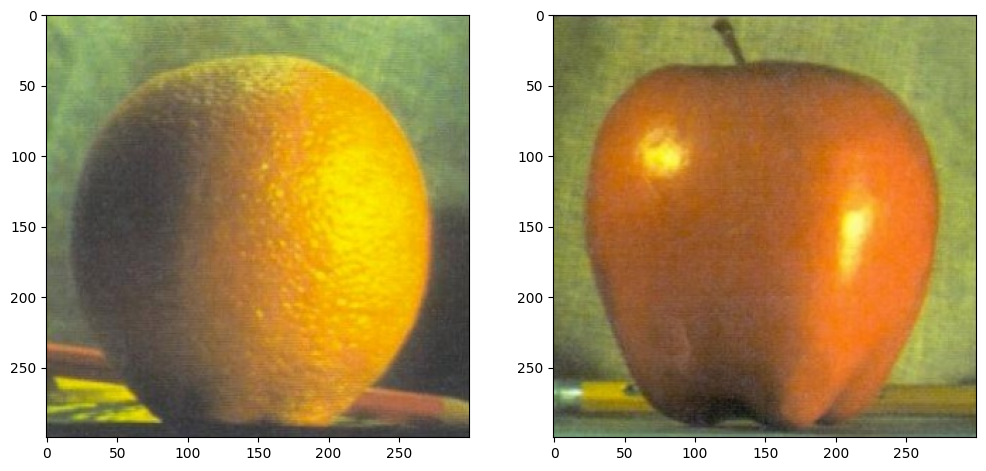
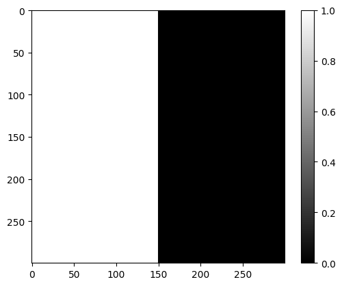
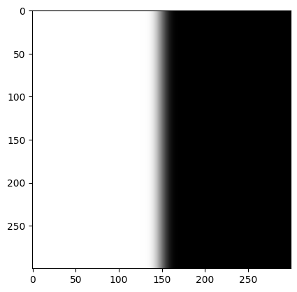
And here’s the filter — just vertical seam down the middle. I found that first passing the filter through a gaussian blurring creates better results. So on the right is the gaussian blurred filter.
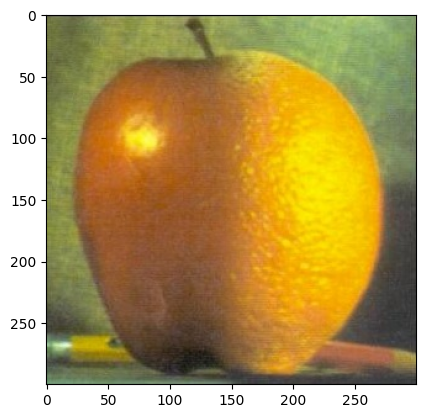
I set the level to 16, with kernel_size = 15 and sigma=5. And we get the orple:
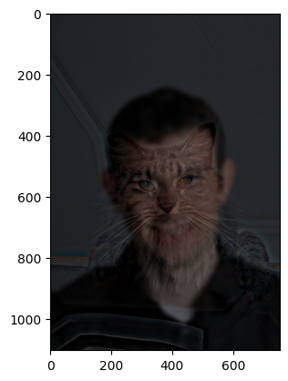
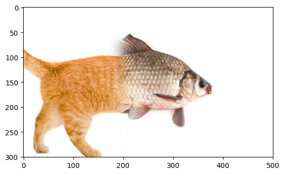
Catfish
let’s make a catfish! here are the original images.
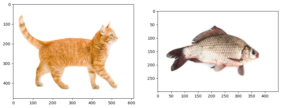
The images have different sizes and the locations don’t really match up. So I aligned the images:

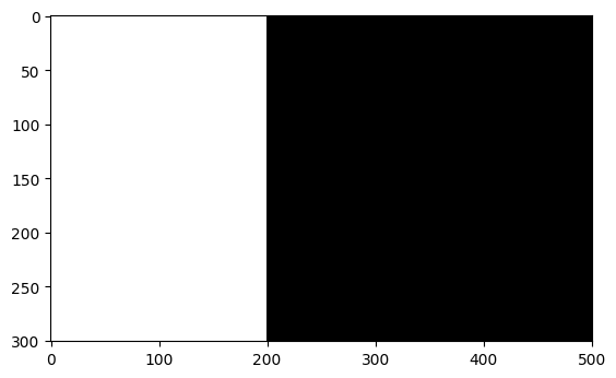
Here is the mask and the result:
Irregular Mask
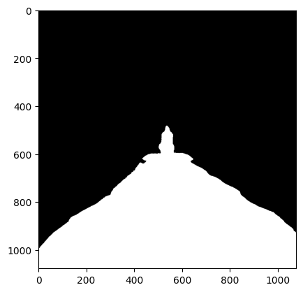
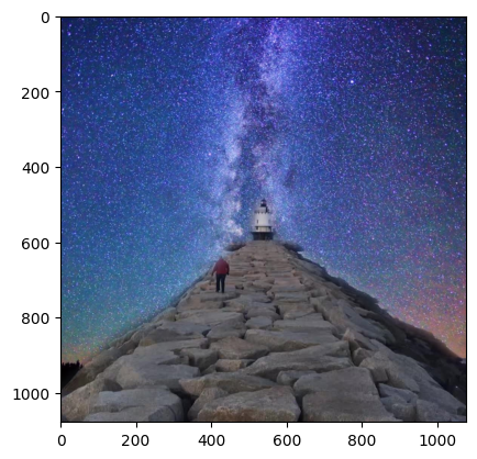
I wanted to make the pier lead to a lighthouse in the sky. Here are the original images:
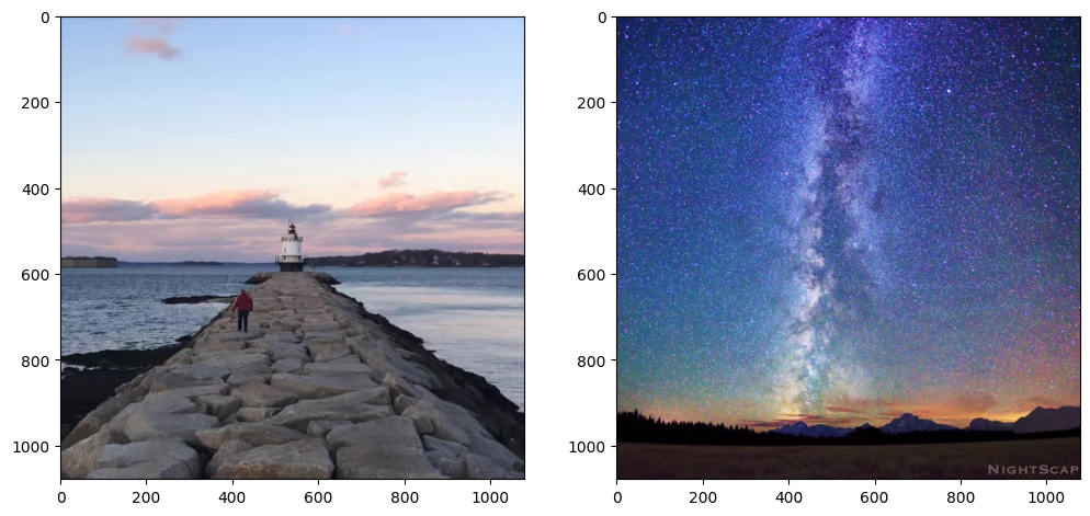
The irregular filter and the final image.
